back to News
Bedspace Brand Launch
15 04 20
Bedspace launched our website and new branding in Autumn of 2019, to coincide with our 20th anniversary celebrations. We were conscious that we did not want to lose the name Bedspace, or stray too far away from the logo and colours customers, staff and clients knew and recognised. We were also conscious that we wished to communicate the work we do at Bedspace in a simple and friendly way, without the use of jargon. To this end, we decided to work with a team of independent creatives from Hebden Bridge in West Yorkshire. Will Lake coordinated the marketing team’s work with Bedspace, utilising his skills as a copywriter to write all the text for our website and marketing brochures, assisted by Graphic Designer Megan Blunn and Web Designer Ffion Atkinson. Sarah Mason, photographer, spent a few days with the Bedspace teams, and took photos of service users and support staff going about their daily tasks.
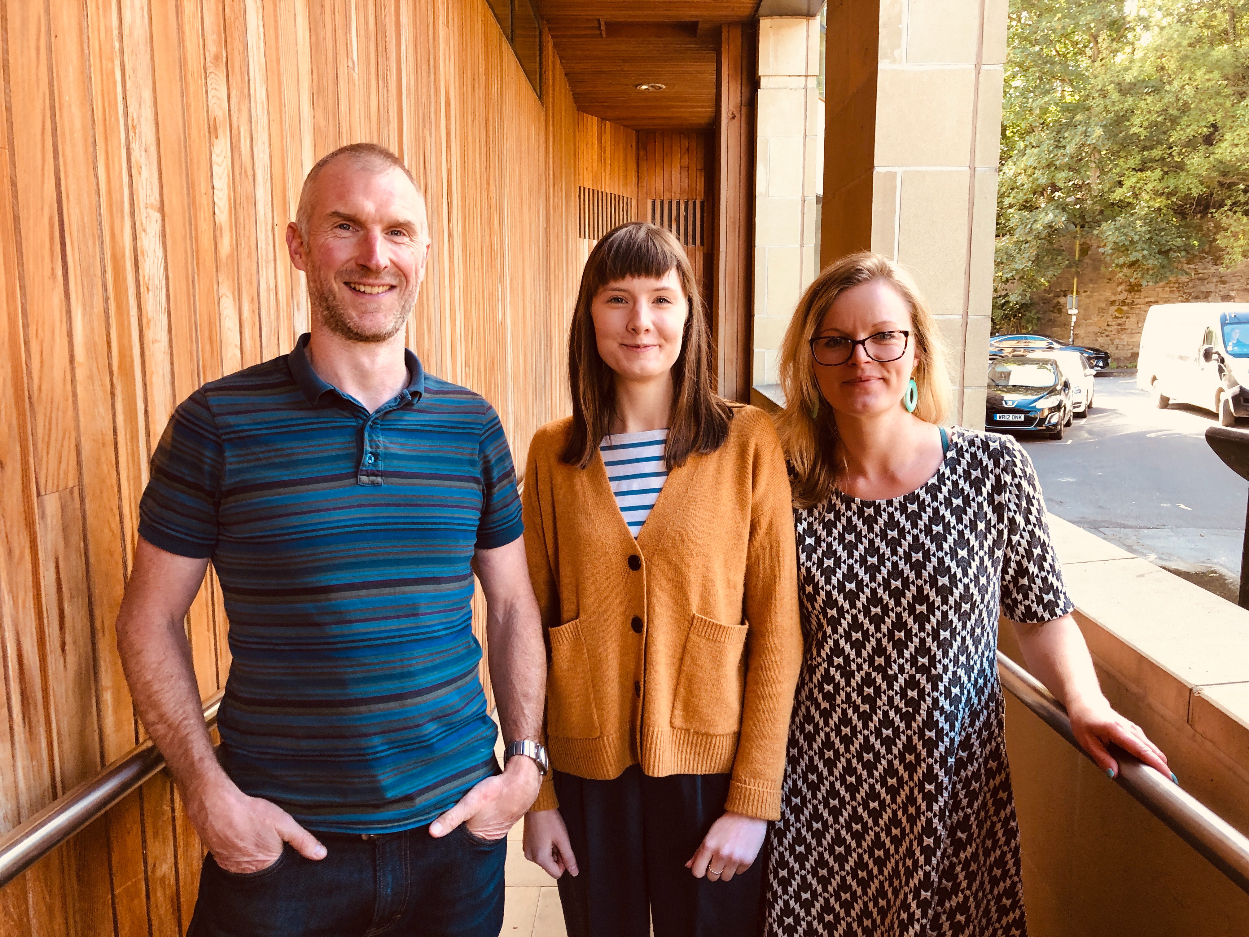
Megan freshened our Bedspace logo and colour palette and updated our logo. Ffion designed our new website and trained staff so we are able to update stories and recruit staff directly. Will coordinated the work on our marketing packs which helps partner agencies understand the work we carry out, the specialist services we provide and what we mean by the terms ‘supported tenancy’ ‘solo placement’ and ‘group living’.
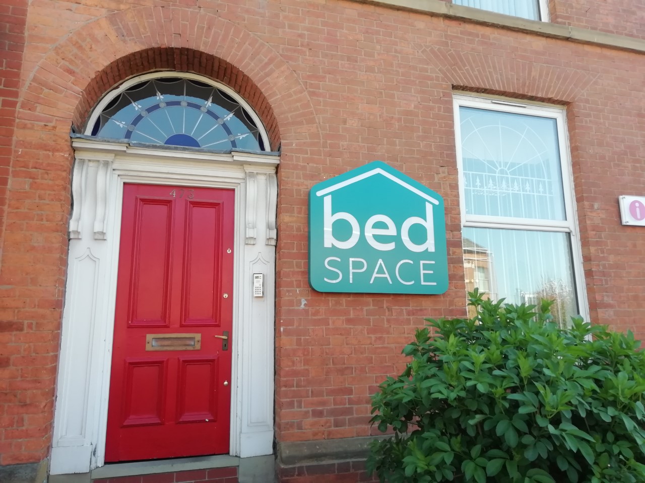
Following our launch, we have been busy refreshing our offices in line with our new look. Manchester, Preston, Liverpool and Leeds offices all have the new Bedspace logo proudly displayed on the office walls. In Liverpool and Manchester, we have added large external signs so we are now much easier to spot!
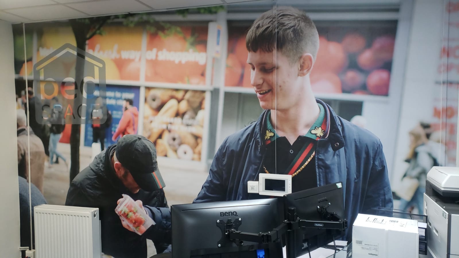
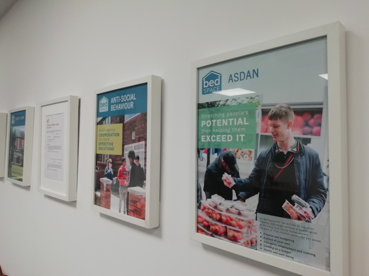
In Liverpool and Manchester, we have transformed our office spaces by displaying huge images on our walls which illustrate the work we do within Bedspace – from supporting a young person to shop for healthy food at reasonable prices to delivering English as a Foreign Language to young asylum seekers. We are proud of the work we do within Bedspace, and pleased that our new look and feel effectively represents us as a caring and compassionate company with a commitment to supporting the most vulnerable in our society.
